
Udok: Identity before aesthetics, for South Africa's largest virtual GP practice.
Go-to-market strategy
Website architecture and copy
Design system & handover
Udok had solved the hard part. The largest virtual GP practice in the country, thousands of appointments behind it, a white-label product live in 75 practices.
What it could not do was be easily understood.
We helped them get clear on their internal identity, defined who the brand is for, and built a go-to-market strategy to fit the two into the same space, before a single visible thing was designed. The colour and visual identity we built next reinforced that same thinking, with the same quality, through how the brand looks and feels.
A company that had solved the hard part and still could not be understood.
Udok is South Africa's largest virtual GP practice, founded in 2017 by Dr Petrus van Niekerk. By the time we arrived, it had the kind of validation most health-tech businesses never reach: appointed by a leading retail group across roughly 200 pharmacy clinics, Standard Bank, Lancet and Ampath in the partner ecosystem, and a white-label practice management product live with 75 practices signed. Product-market fit was found. Brand positioning was not.
The market sharpened the urgency. South African telehealth sat at roughly R17.4 billion in 2024, growing at 27.5% a year, projected to reach R71.4 billion by 2030. Only 17% of South Africans hold private cover, yet private care absorbs half of the country’s health spend. And every competitor was saying the same four things: no queues, no waiting, affordable, on your phone. Well-backed rivals held the best brand in the category, the biggest distribution partner, and the outside capital.
Udok knew what it did. However, it did not clearly know who it was, who it was for, or how those two things met. And the founder had been burned by agencies before, so trust had to be earned through output, not promises.
THE STRATEGIC MOVE: Identity before aesthetics.
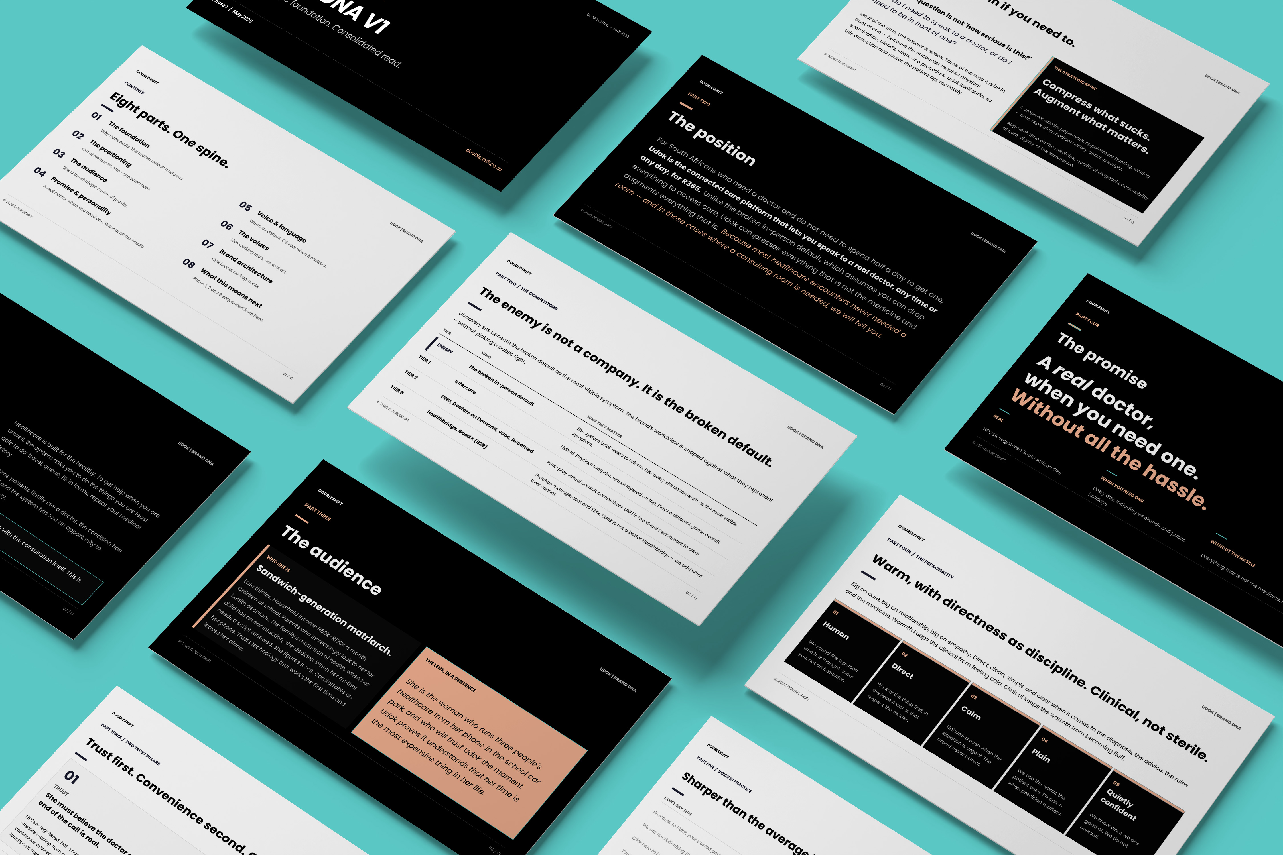
- We did not start with the logo. We started with the internal identity: what Udok believes, values, sounds like - and charges. The category moved from 'telehealth' to connected care, while keeping 'online doctor' as the search language patients actually type. The value proposition was rebuilt: not cheaper healthcare, but a real doctor, reached real fast. The enemy was named as the broken in-person default, which gave the brand something to push against without ever attacking a competitor.
- The promise: a real doctor, when you need one, without all the hassle.
- Pricing became part of the brand. A single transparent price, R365, including in-person care. No tiering, no 'starting from' prices, and no after-hours penalty language. In a category of hidden costs, we made price transparency a trust behaviour, not a finance decision.
- Then the external identity, compressed to one sharp lens: the sandwich-generation matriarch, late thirties, middle income, managing a household's healthcare - her own, her children's and increasingly her parents'. She decides whether the family sees a doctor. She is the lens we look through and informs all our decisions. Targeting, channel choice, casting, photography and messaging emphasis all calibrate to her, but the brand never says 'for moms', because the 20-year-old with a sinus infection on a Sunday is also a Udok patient. Design for her, and the rest takes care of itself.
She is the lens through which we make all decisions.

Internal identity, external identity, and the go-to-market that brought them together.
Brand foundations
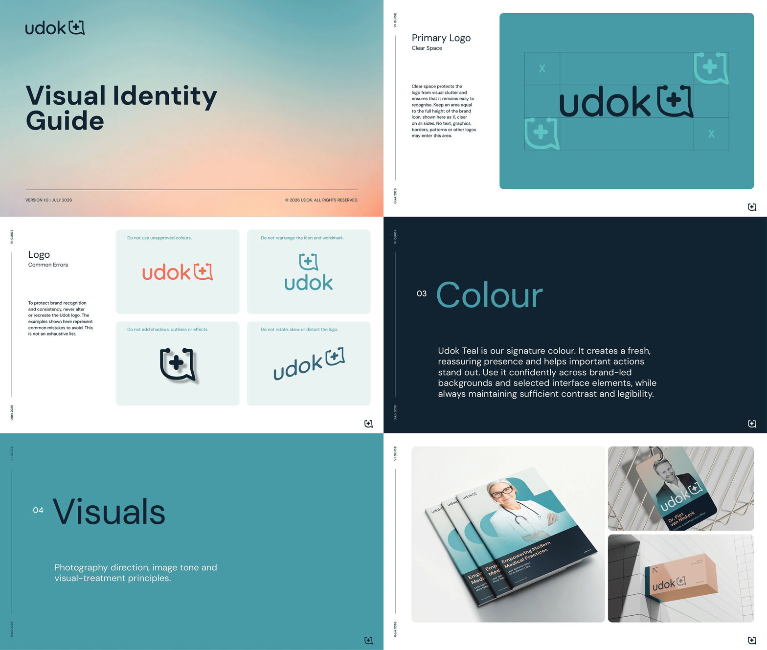
The Udok Brand DNA, delivered as a canonical operating document with a consolidated version and a presentation deck: category, value proposition, promise, five personality attributes, five values written as decision-making tools rather than wall art, and a voice system with six tone principles that flexes between consumer and clinical registers, down to standing language rules.
Brand architecture made Udok the master brand and gave the white-label product clear rules: the practice's brand leads, powered by Udok, present by default in select touchpoints. Partnership posture was set as control or invisibility, nothing in between.
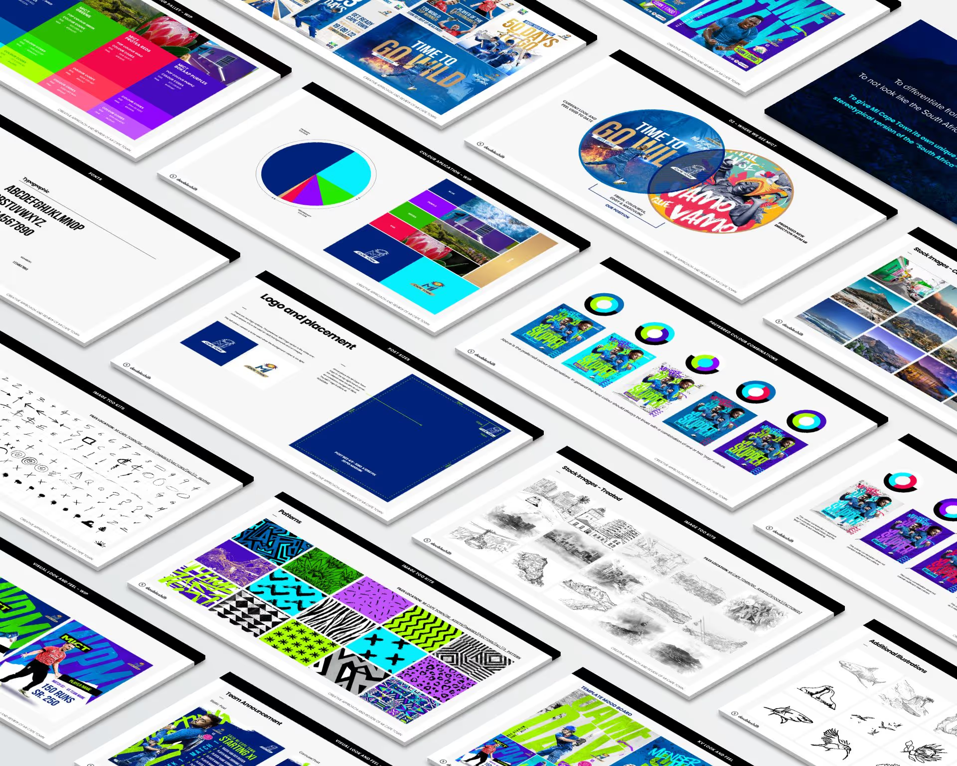
On visual identity, we developed a new direction, but the founder chose continuity. So the original logo mark stayed, but everything around it was rebuilt. Voice, system rules, photography direction, pricing posture, architecture and the website. The strategic work was strong enough that the brand did not need a refreshed logo to become a refreshed brand.
Go-to-market as the bridge
The go-to-market strategy brought the internal and external identities into the same space.
The principles were written to be operable: different channels carry people through different stages, referrals stay honest and never incentivised, acquisition cost is framed against margin, and advocacy is consumer-only.
Website design and build
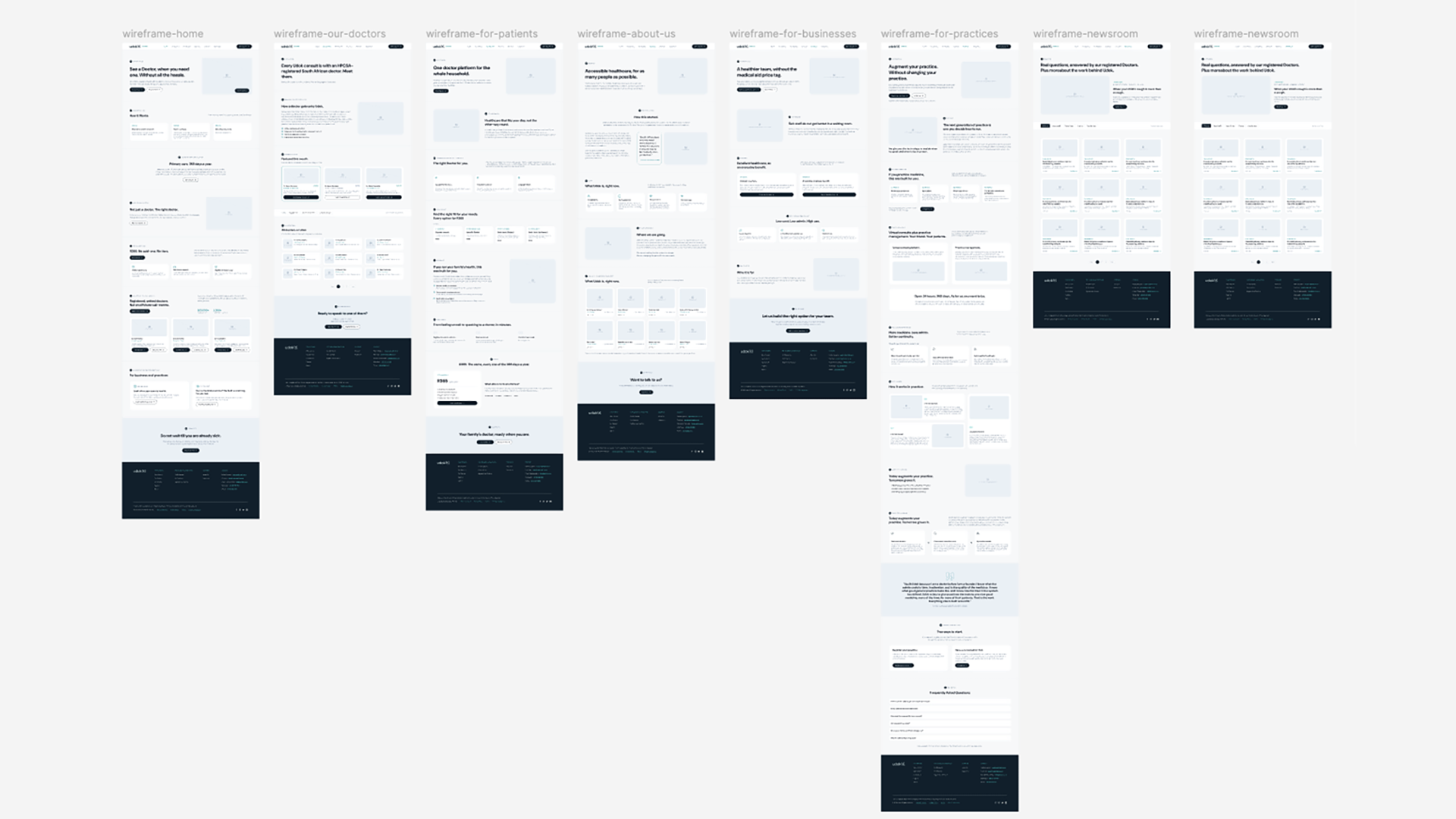
The site was architected around the healthy-user and sick-user distinction, with services split for patients, businesses and practices. Four ways to see a doctor were surfaced: express, now with a specific doctor, later online, later in person, all at one price. We took the page-by-page copy through client review to final, humanised the practice through doctor profiles, and designed the homepage across every breakpoint.
Then the handover, which is itself the point: a Figma design system and handover pack for Udok's own tech team to build the remaining pages and carry into the digital product. We hand over. We do not hold hostage.
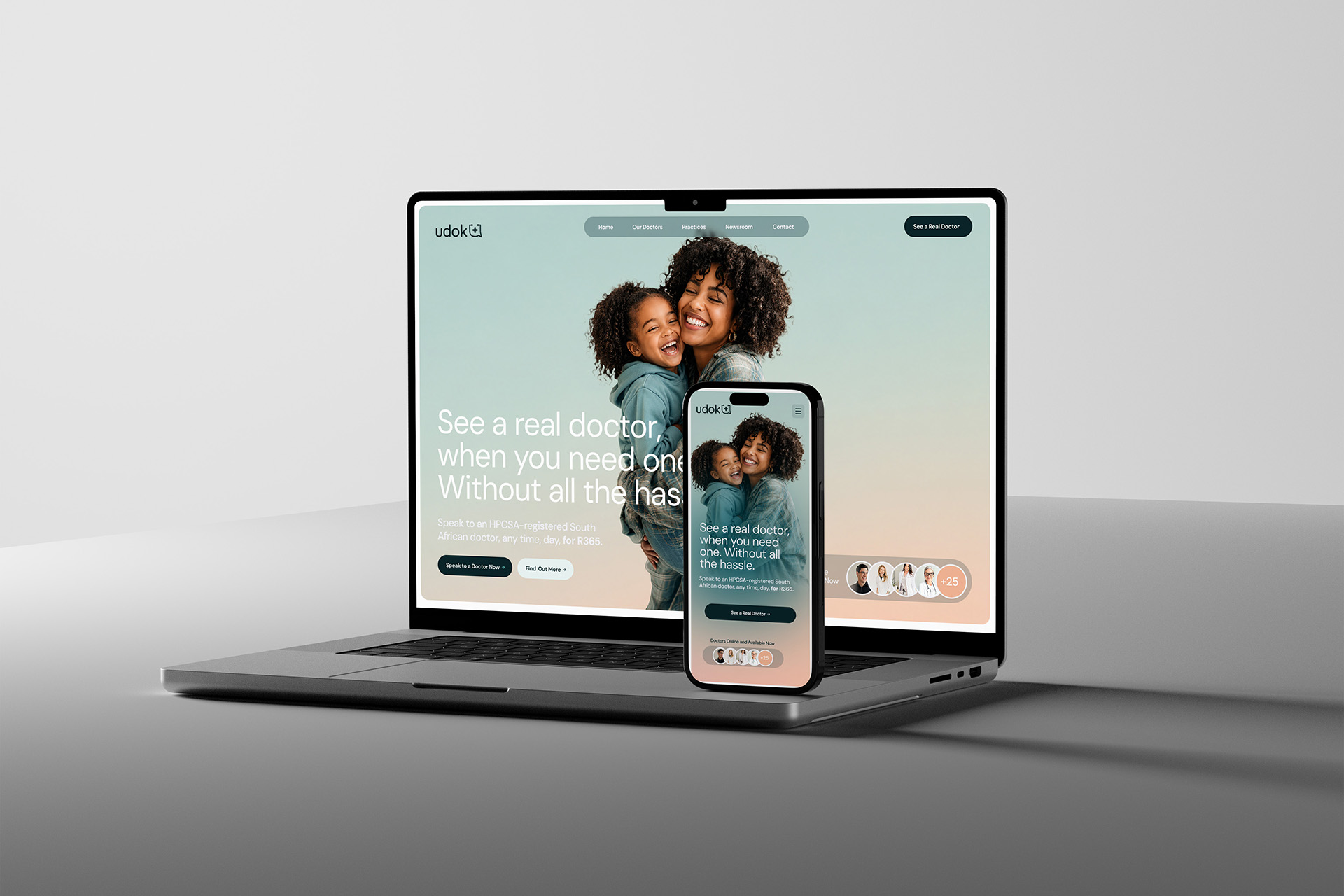
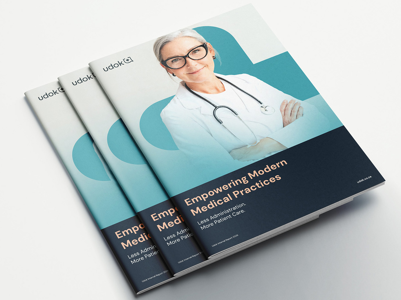
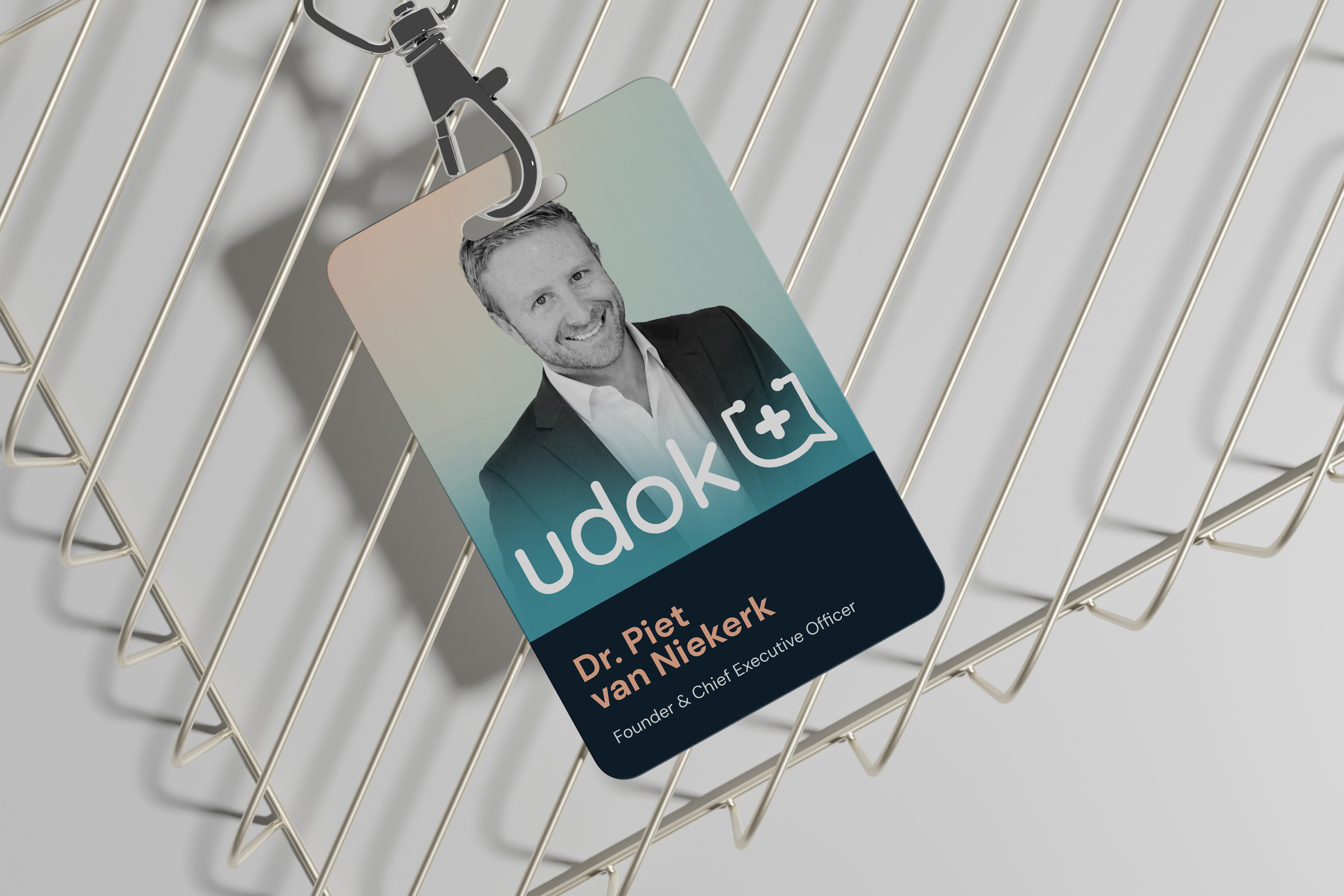
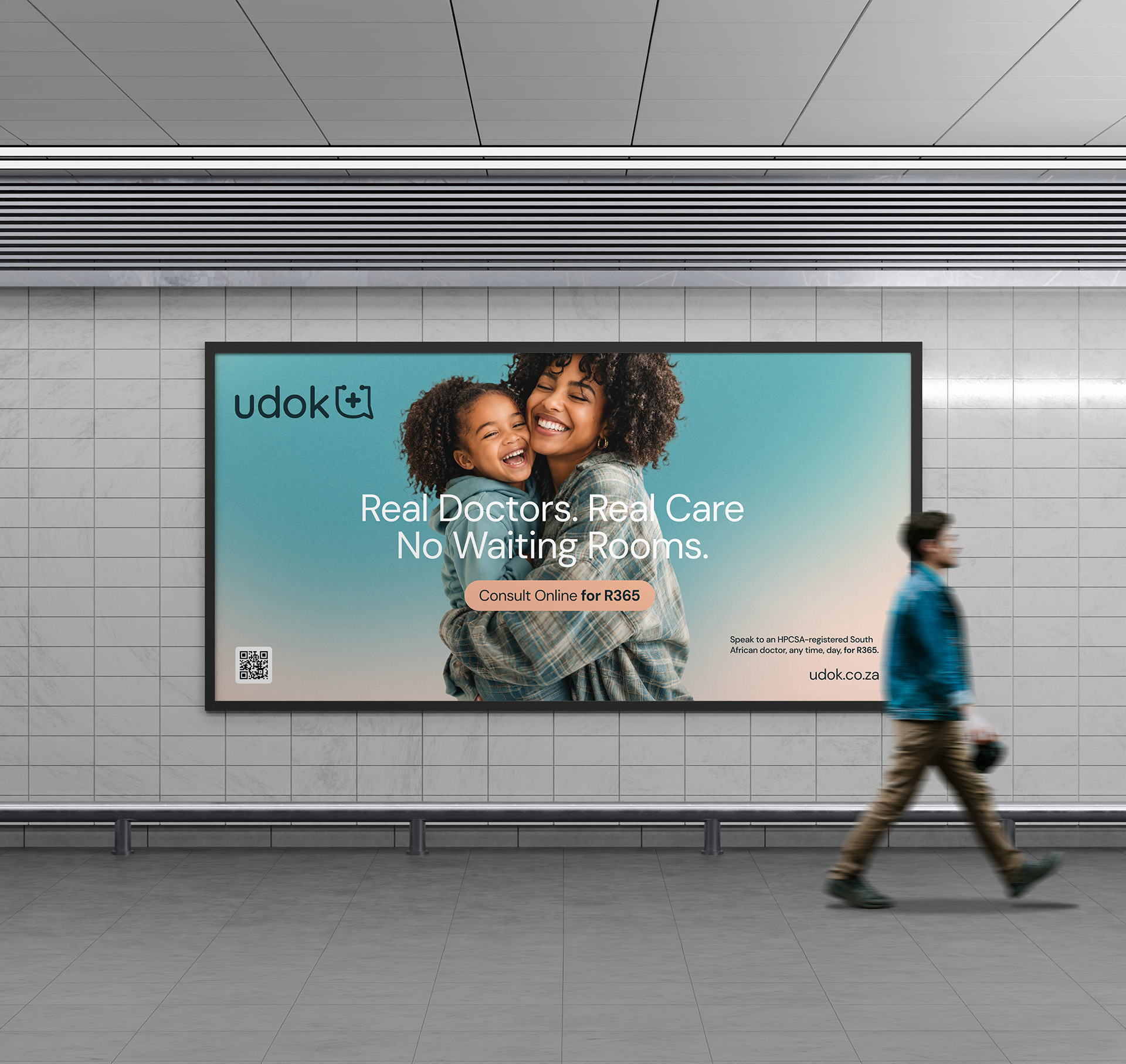
Brand work that starts with the logo produces a look.
This produced a company that can be understood.
In a category where every competitor says the same four things, the identity work is the differentiation. Udok's advantage was real before we arrived: the distribution, the partners, the product. Our work gave it a self, an audience and a bridge between the two, and only then a look. The look mattered less than most engagements pretend, and the client's choice to keep the mark proves it.
The discipline also travels. The same method that holds for payments infrastructure holds for healthcare, because both categories sell trust before they sell anything else. High-trust, high-complexity is the thread.
THE PROOF
Understood, at last.
One brand, one promise, one price, coherent from the website to roughly 200 partner clinics and 75 white-labelled practices.
A brand that starts inside.
A canonical Brand DNA the team runs decisions through, with values and voice written as tools, not decoration.
AN OFFER PEOPLE CAN READ.
App, three card tiers and the token explained in one clear product hierarchy.
One price, said plainly.
R365, including in-person, held as a brand attribute in a category of hidden tiers and 'from' pricing.
A strategy that operationalises.
Consumer, practice and employer playbooks with an hourglass journey and segmented retention the team can run.
A site their own team built.
A Figma design system handed to Udok's in-house developers, carried from the website into the digital product.
"DoubleShift took on Renegade’s brand DNA, design and website relaunch, and absolutely blew us away.
We had a very particular vision in our heads, and they captured it. That alone would have made us happy. But some of the strongest parts of the final result came from ideas they brought to the table - things we hadn’t considered that made Renegade so much richer. They really listened, took our wishes seriously, and still brought a strong creative point of view. We got the Renegade we had imagined, with a whole new level of ambition.
What surprised us most was how much the process clarified our own thinking. Working with them helped us understand what Renegade really is, what it stands for, and how to express that. That has stayed with us well beyond the website launch and moved our work forward enormously.
The result was miles beyond the brief and our expectations. Easily one of the best collaborations we’ve had in years. We’d choose them again without a second thought."
We build beautiful brands that move people.
If you are building something ambitious in a high-trust, high-complexity industry, we should talk. Not a pitch. A conversation about your business and how strategic creative leadership can help you grow.


Brand & Creative Leadership for High-Trust, High-Complexity Industries.