
Renegade: a brand for the space between crypto and traditional finance.
Visual identity expansion
Website copy
Website design and build
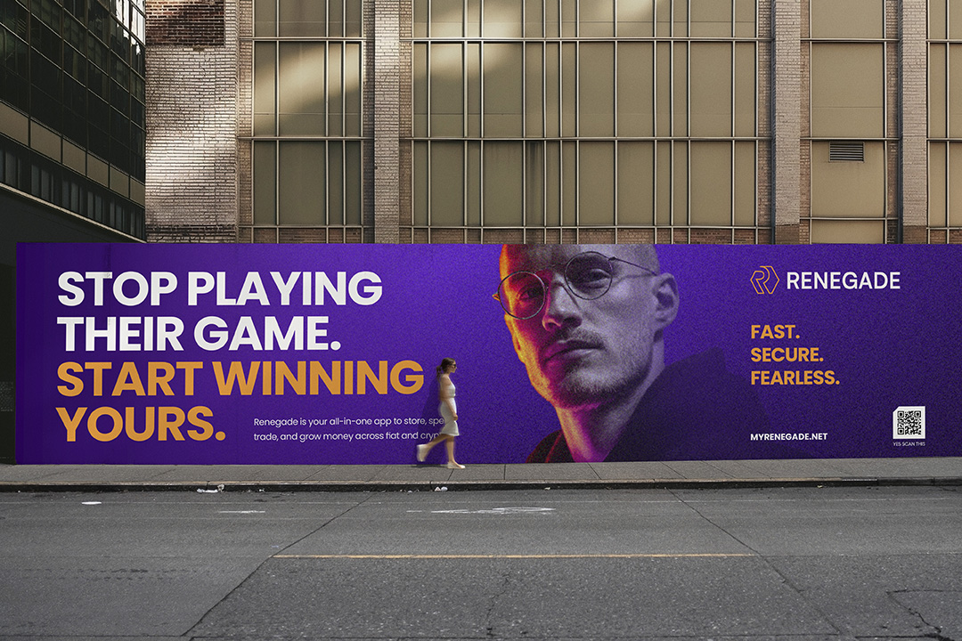
Renegade gives people one app to store, spend, trade and grow money across fiat and crypto. Ahead of Token2049 Singapore, the founders needed an identity with conviction and a website that explained the offer without the category noise.
Working directly with the leadership team, we rebuilt the brand foundations, extended the visual identity and designed and built the site in parallel - in just five weeks.
A BRAND CAUGHT BETWEEN TWO AUDIENCES THAT DISTRUST EACH OTHER.
Renegade sits between crypto-native users tired of hype and traditional-finance users tired of friction. Each side is suspicious of the other's world, and a brand that leans too far either way loses one of them.
Renegade had a logo, a palette and a product with real range: app, card, token, custodial and non-custodial. What it lacked was a narrative with depth, a visual system beyond the mark, or a website that made the offer legible. With investors, users and partners about to meet the brand in one room in Singapore, the gap was clarity and conviction, not features.
THE STRATEGIC MOVE: PRINCIPLED CHALLENGER, NOT RECKLESS REBEL.
- The name invites a rebel posture, and the category rewards it in the short term. We took the brand somewhere more durable: a principled challenger, disciplined and educated, that questions the system without burning it down. The enemy is not banks. It is hype, noise and the systems that keep people from understanding their own money.
- That decision changed the copy from fighting back to belonging. Renegade is a toolset and a tribe for the long game: rewards for staying, ranks for progress, training for mastery. It also set the discipline on how the token and the community are described, so ambition on the page never outran what the business could responsibly say.
Rebellion wins attention. Discipline keeps it. Renegade is built for the long game, and the brand now says so.

Brand foundations, a visual system and a website, built in parallel.
Brand foundations and visual identity
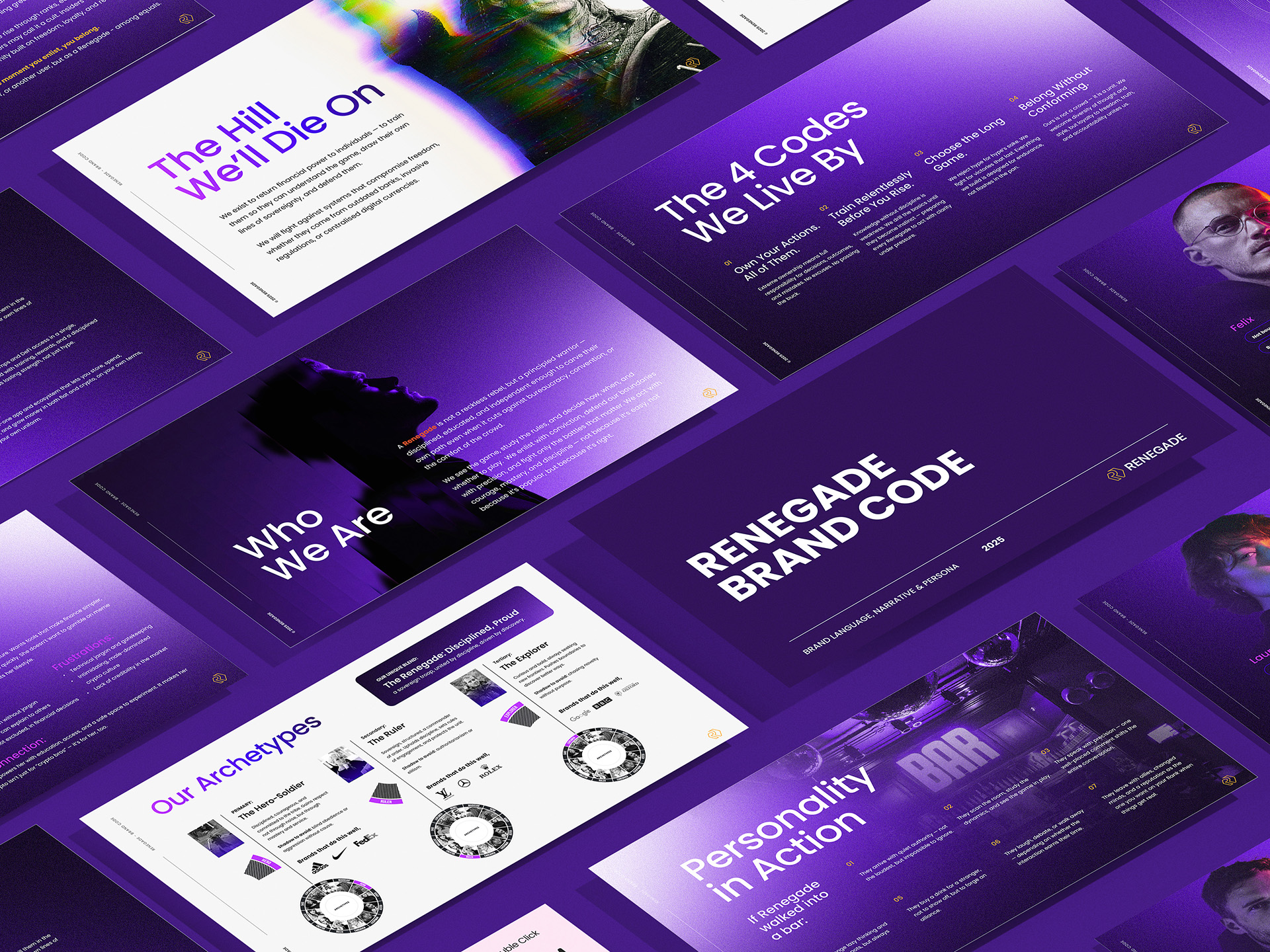
A half-day workshop with leadership became the Renegade Brand Code: purpose, personality, narrative and the audiences the brand serves, written as a working document the team applies without us. The existing logo and orange were retained and extended into a full system: colour hierarchy, typography, image treatment and graphic devices, on a deep purple-to-black ground that gives the orange somewhere to land.
Website design and build
Product over storytelling. Home, About, App, Cards and Token pages lead with what Renegade does, with the tribe narrative as the through-line rather than the headline. The site was designed and built in Webflow rather than handed over as Figma, so the 3D card, glass surfaces and motion the brand called for could ship on the deadline. Copy, design and development ran as one stream with the founders in the loop throughout.
Speed is not the enemy of rigour.
A brand can be rebuilt properly in five weeks if strategy, identity and web are shaped together rather than in sequence, and if the founders are in the room for the decisions that matter. Renegade shows what the parallel process delivers under a real deadline.
It also shows where we sit: alongside founders building ambitious consumer fintech brands in a category that runs on hype, giving them the discipline that makes the ambition credible.
THE PROOF
LAUNCHED FOR TOKEN2049.
Brand, identity and website live for the Singapore stage, on a five-week programme.
A BRAND WITH A SPINE.
A challenger with discipline, not a rebel with a token, expressed consistently from manifesto to microcopy.
AN OFFER PEOPLE CAN READ.
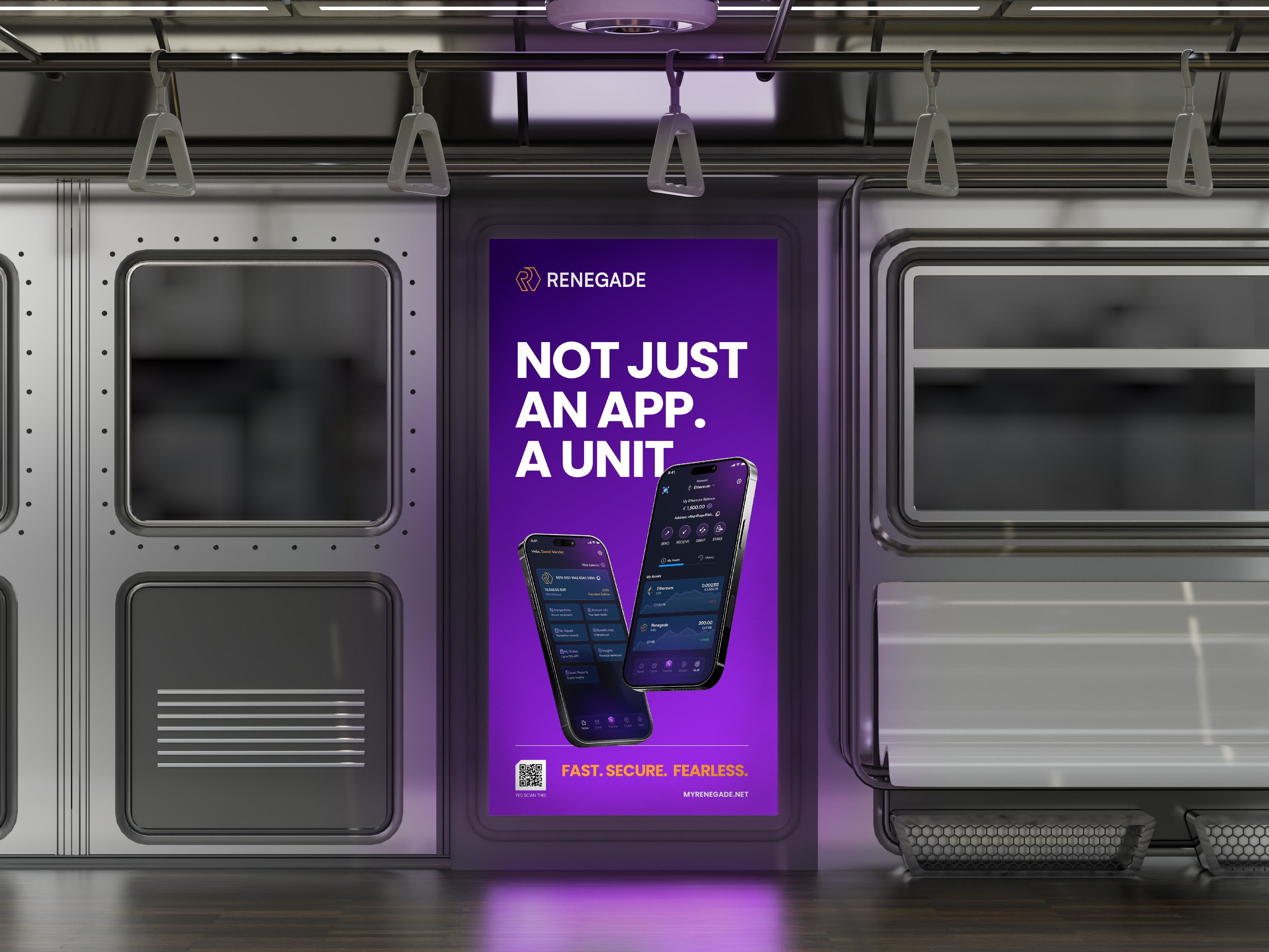
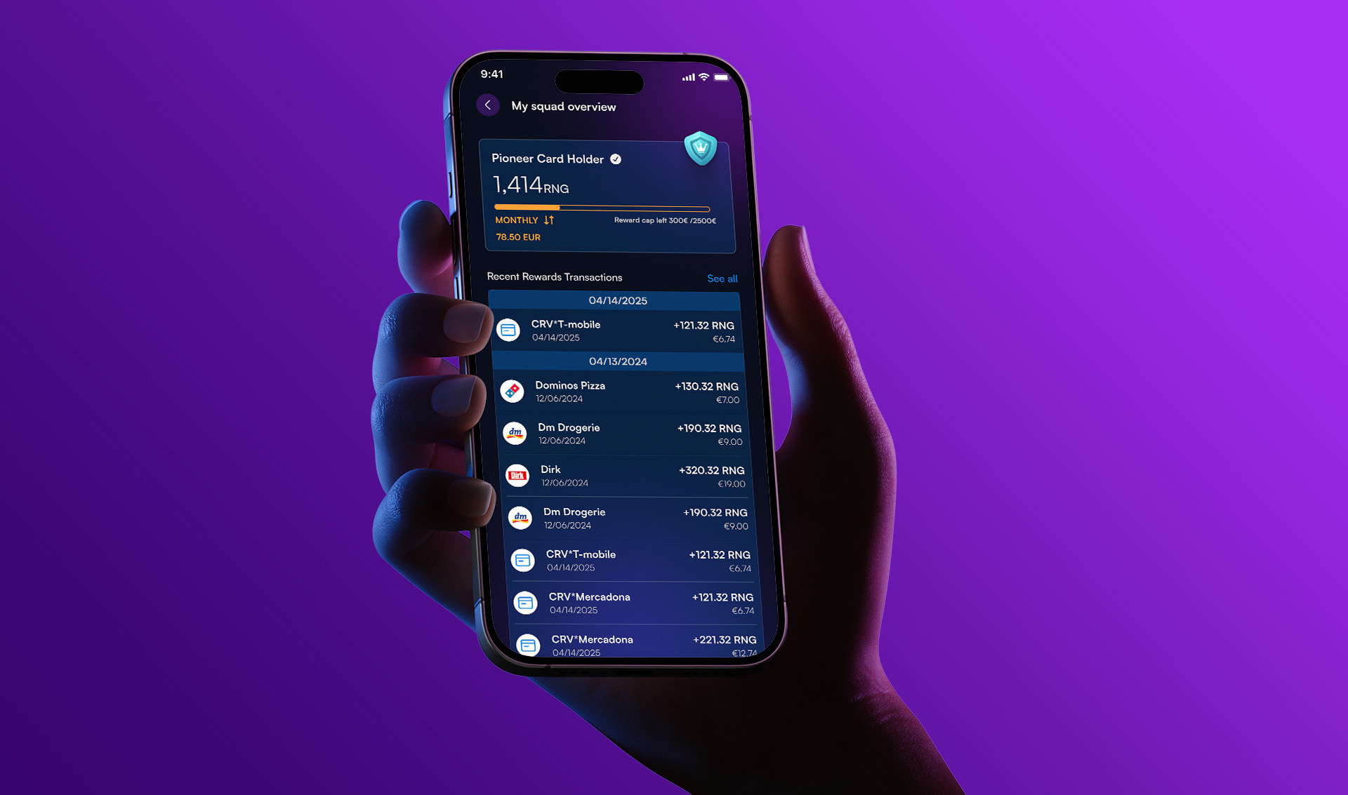
App, three card tiers and the token explained in one clear product hierarchy.
A SYSTEM THE TEAM RUNS.
Brand Code, visual identity guidelines and a Webflow site the in-house team maintains.
RESPONSIBLE AMBITION.
Token and community language written to hold up in front of regulators as well as users.
"DoubleShift took on Renegade’s brand DNA, design and website relaunch, and absolutely blew us away.
We had a very particular vision in our heads, and they captured it. That alone would have made us happy. But some of the strongest parts of the final result came from ideas they brought to the table - things we hadn’t considered that made Renegade so much richer. They really listened, took our wishes seriously, and still brought a strong creative point of view. We got the Renegade we had imagined, with a whole new level of ambition.
What surprised us most was how much the process clarified our own thinking. Working with them helped us understand what Renegade really is, what it stands for, and how to express that. That has stayed with us well beyond the website launch and moved our work forward enormously.
The result was miles beyond the brief and our expectations. Easily one of the best collaborations we’ve had in years. We’d choose them again without a second thought."

We build beautiful brands that move people.
If you are building something ambitious in a high-trust, high-complexity industry, we should talk. Not a pitch. A conversation about your business and how strategic creative leadership can help you grow.


Brand & Creative Leadership for High-Trust, High-Complexity Industries.